Vocational Steam Works Brand
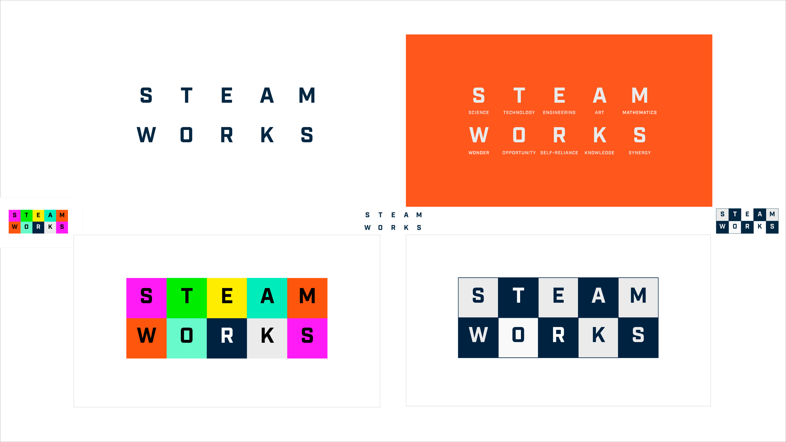
Vocational Steam Works not only teaches STEAM vocational skills – Science Technology Engineering Art Mathematics. Kids also learn life skills – Wonder Opportunity Self-Reliance Knowledge and Synergy. Teaching kids to have wonder, create opportunities for themselves, grow their knowledge and to have synergy when they work together in teams.
Multimedia
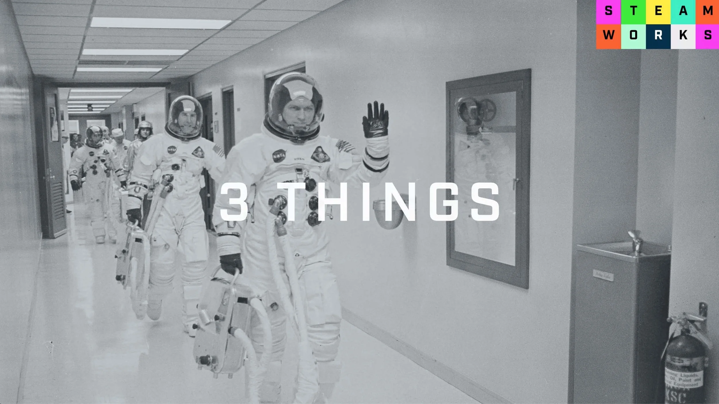
3 Things – Interview with John Pacente
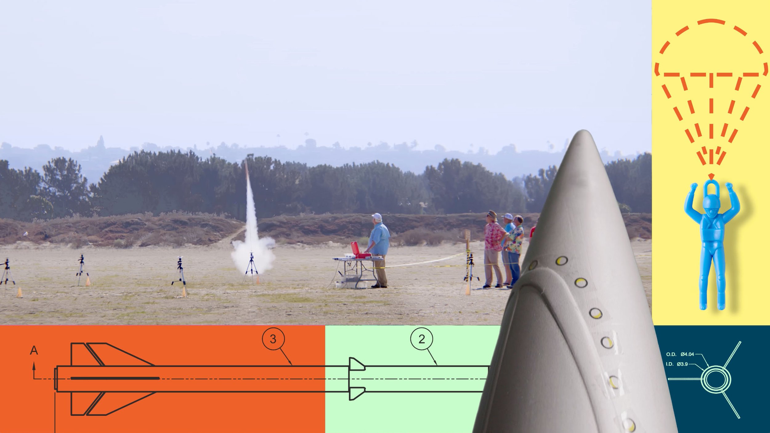
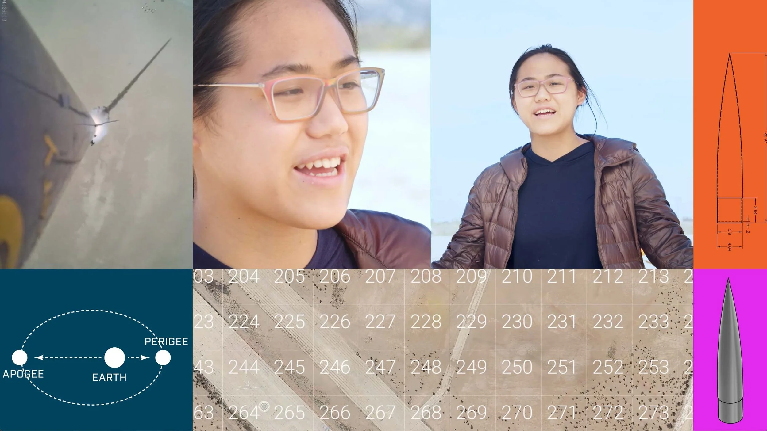
Four layouts as grids for populating with footage: 1:1, 16:9, 100:185 and 4:3. Grids are enlarged logo boxes
Layout 01 of 4 – Three Things – A 1:1 grid system to be populated with video footage, stills. typography, drawings, logos as moving parts
Chapter Head – 3 Things
Chapter Head – Game Changers
Chapter Head – KISS
Layout 03 of 4 – KISS – 16x9 grid system to be populated with video footage, stills, typography, drawings, logos as moving parts
Chapter Head – The Ask
SAmple of a layout for Game Changers chapter
Each of the words in steam works is five letters allowing the opportunity to place them in a box.
The type font is ‘Industry’, designed by Mattox Shuler at the Fort Foundry, which he refers to as ‘The Toolbox of Type’ which make the font appropriate for Vocational Steamworks. Industry has the ‘look and feel’ of science and is available for free download in Adobe Fonts for use in print and online. Most important is it is easily readable.
When you box the individual letters with the representative words placed below they take on the feeling of the tabular display of the Periodic Table of the Elements which is generally scene as the icon of Science. The color palette is guided by the colors on the current website. The colors are youthful, exciting and inspirational. Using one color appears to be more simple and sophisticated. Using combinations of colors more active and complex.
This is an example of the colored configuration of the logo with out the words. This allows for the ability to use the logo very small because without including words there is no need to regulate the size to insure readability. Usages that require smaller logos are things like buttons and baseball caps.
Placing Vocational in the configuration changes the overall shape of the logotype and requires the type be used at a size that insures readability.
Configurations of the logomark all have the same look and feel whether they be on black and white, one-color-or full color. The black and white checkered version represents the simple notion of off-and-on. The smaller versions show readability at very small sizes.
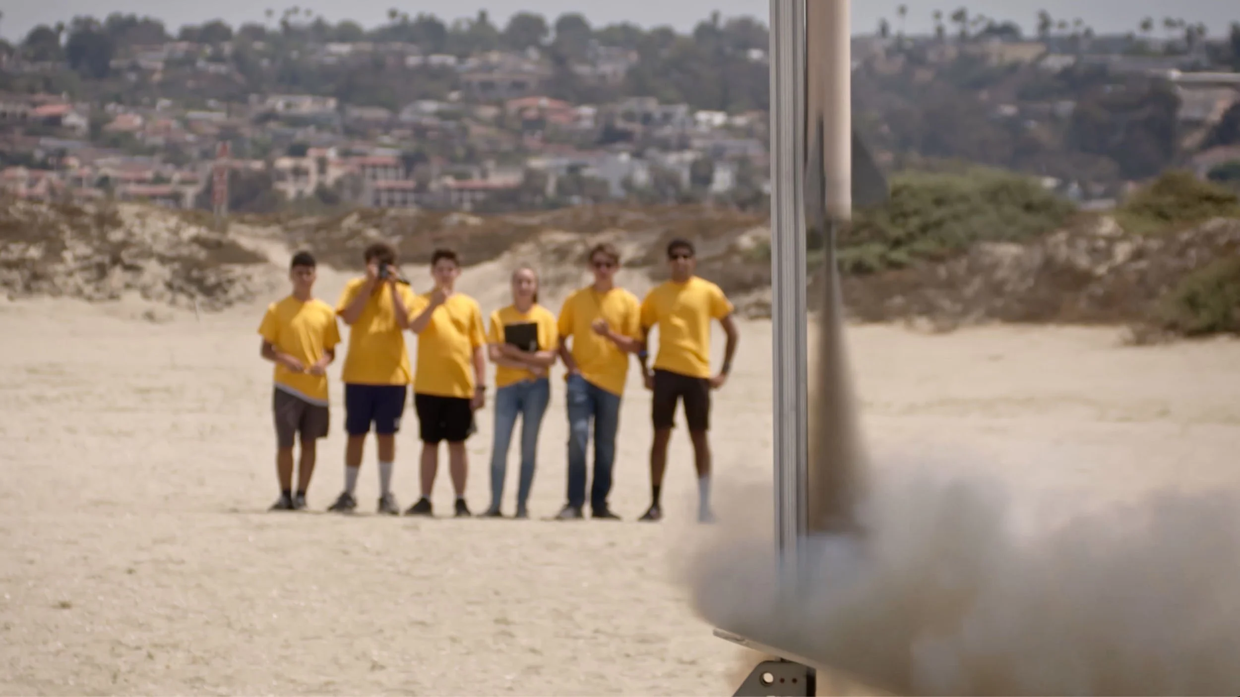
When the Skyscraper TARC team wear bright yellow shirts at a launch they stand out in a crowd appear to be very bright kids. T-shirts are walking billboards.
Here is another example of a ‘Launch Shirt’.


